Creating a Theme
Atom's interface is rendered using HTML, and it's styled via Less which is a superset of CSS. Don't worry if you haven't heard of Less before; it's just like CSS, but with a few handy extensions.
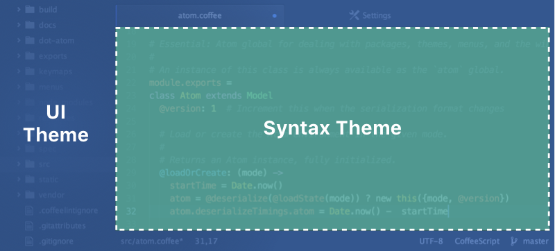
Atom supports two types of themes: UI and Syntax. UI themes style elements such as the tree view, the tabs, drop-down lists, and the status bar. Syntax themes style the code, gutter and other elements inside the editor view.
Themes can be installed and changed from the Settings View which you can open by selecting the Atom > PreferencesFile > PreferencesEdit > Preferences menu, and clicking the "Install" or "Themes" tab on the left hand navigation.
Getting Started
Themes are pretty straightforward but it's still helpful to be familiar with a few things before starting:
- Less is a superset of CSS, but it has some really handy features like variables. If you aren't familiar with its syntax, take a few minutes to familiarize yourself.
- You may also want to review the concept of a
package.json(as covered in Atompackage.json). This file is used to help distribute your theme to Atom users. - Your theme's
package.jsonmust contain athemekey with a value ofuiorsyntaxfor Atom to recognize and load it as a theme. - You can find existing themes to install or fork in the atom.io themes registry.
Creating a Syntax Theme
Let's create your first theme.
To get started, press Cmd+Shift+PCtrl+Shift+P and start typing "Generate Syntax Theme" to generate a new theme package. Select "Generate Syntax Theme," and you'll be asked for the path where your theme will be created. Let's call ours motif-syntax.
Tip
Tip: Syntax themes should end with -syntax and UI themes should end with -ui.
Atom will display a new window, showing the motif-syntax theme, with a default set of folders and files created for us. If you open the Settings View with Cmd+,Ctrl+, and click the "Themes" tab on the left, you'll see the "Motif" theme listed in the "Syntax Theme" drop-down. Select it from the menu to activate it, now when you open an editor you should see your new motif-syntax theme in action.
Open up styles/colors.less to change the various color variables which have already been defined. For example, turn @red into #f4c2c1.
Then open styles/base.less and modify the various selectors that have already been defined. These selectors style different parts of code in the editor such as comments, strings and the line numbers in the gutter.
As an example, let's make the .gutter background-color into @red.
Reload Atom by pressing Alt+Cmd+Ctrl+LAlt+Ctrl+R to see the changes you made reflected in your Atom window. Pretty neat!
Tip
Tip: You can avoid reloading to see changes you make by opening an Atom window in Dev Mode. To open a Dev Mode Atom window run atom --dev . in the terminal, or use the View > Developer > Open in Dev Mode menu. When you edit your theme, changes will instantly be reflected!
Note
Note: It's advised to not specify a font-family in your syntax theme because it will override the Font Family field in Atom's settings. If you still like to recommend a font that goes well with your theme, we suggest you do so in your README.
Creating a UI Theme
To create a UI theme, do the following:
- Fork the ui-theme-template
- Clone the forked repository to the local filesystem
- Open a terminal in the forked theme's directory
- Open your new theme in a Dev Mode Atom window run
atom --dev .in the terminal or use the View > Developer > Open in Dev Mode menu - Change the name of the theme in the theme's
package.jsonfile - Name your theme end with a
-ui, for examplesuper-white-ui - Run
apm link --devto symlink your repository to~/.atom/dev/packages - Reload Atom using Alt+Cmd+Ctrl+LAlt+Ctrl+R
- Enable the theme via the "UI Theme" drop-down in the "Themes" tab of the Settings View
- Make changes! Since you opened the theme in a Dev Mode window, changes will be instantly reflected in the editor without having to reload.
Tip
Tip: Because we used apm link --dev in the above instructions, if you break anything you can always close Atom and launch Atom normally to force Atom to the default theme. This allows you to continue working on your theme even if something goes catastrophically wrong.
Theme Variables
UI themes must provide a ui-variables.less and Syntax themes a syntax-variables.less file. It contains predefined variables that packages use to make sure the look and feel matches.
Here the variables with the default values:
These default values will be used as a fallback in case a theme doesn't define its own variables.
Use in Packages
In any of your package's .less files, you can access the theme variables by importing the ui-variables or syntax-variables file from Atom.
Your package should generally only specify structural styling, and these should come from the style guide. Your package shouldn't specify colors, padding sizes, or anything in absolute pixels. You should instead use the theme variables. If you follow this guideline, your package will look good out of the box with any theme!
Here's an example .less file that a package can define using theme variables:
@import "ui-variables";

.my-selector {
	background-color: @base-background-color;
	padding: @component-padding;
}
@import "syntax-variables";

.my-selector {
	background-color: @syntax-background-color;
}
Development workflow
There are a few tools to help make theme development faster and easier.
Live Reload
Reloading by pressing Alt+Cmd+Ctrl+LAlt+Ctrl+R after you make changes to your theme is less than ideal. Atom supports live updating of styles on Atom windows in Dev Mode.
To launch a Dev Mode window:
- Open your theme directory in a dev window by selecting the View > Developer > Open in Dev Mode menu item
- Or launch Atom from the terminal with
atom --dev
If you'd like to reload all the styles at any time, you can use the shortcut Alt+Cmd+Ctrl+LAlt+Ctrl+R.
Developer Tools
Atom is based on the Chrome browser, and supports Chrome's Developer Tools. You can open them by selecting the View > Developer > Toggle Developer Tools menu, or by using the Alt+Cmd+ICtrl+Shift+I shortcut.
The dev tools allow you to inspect elements and take a look at their CSS properties.
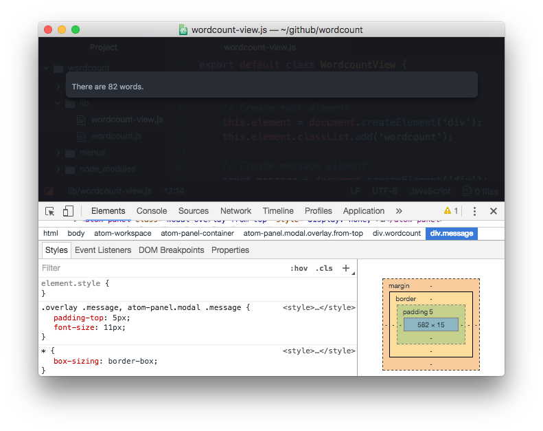
Check out Google's extensive tutorial for a short introduction.
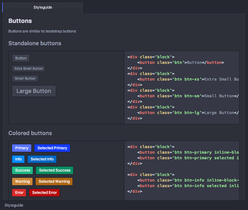
Atom Styleguide
If you are creating an UI theme, you'll want a way to see how your theme changes affect all the components in the system. The Styleguide is a page that renders every component Atom supports.
To open the Styleguide, open the command palette with Cmd+Shift+PCtrl+Shift+P and search for "styleguide", or use the shortcut Cmd+Ctrl+Shift+GCtrl+Shift+G.
Side by side
Sometimes when creating a theme (or package) things can go wrong and the editor becomes un-usable. E.g. if the text and background have the same color or something gets pushed out of sight. To avoid having to open Atom in "normal" mode to fix the issue, it's advised to open two Atom windows. One for making changes and one in Dev Mode to see the changes getting applied.
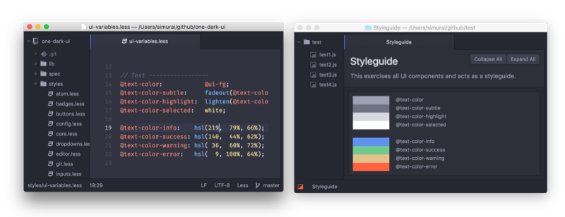
Make changes on the left, see the changes getting applied in "Dev Mode" on the right.
Now if you mess up something, only the window in "Dev Mode" will be affected and you can easily correct the mistake in your "normal" window.
Publish your theme
Once you're happy with your theme and would like to share it with other Atom users, it's time to publish it. 🎉
Follow the steps on the Publishing page. The example used is for the Word Count package, but publishing a theme works exactly the same.